




UX and SEO reinforce each other when a page answers a search, loads without getting in the way and leads visitors to the information they expect. A better experience still guarantees no gain in Google. To decide what to fix, tell apart technical obstacles, navigation difficulties and gaps between query and content: these problems are not fixed the same way and are not measured with the same indicators.
To prioritise, handle visibility in search results, how the page works and what visitors manage to do on it as separate questions.
UX and SEO: where do they really meet?
A good experience helps visibility because it makes content easier to find, understand and use, but it does not guarantee a better ranking. SEO works on presence in search results; UX design looks at what visitors manage to do once they arrive.
| Dimension | Real example | What you can conclude |
|---|---|---|
| Search tracking | Google Search Console | Observed rankings show visibility, without explaining the quality of the journey on their own. |
| Interface performance | Lighthouse | The technical diagnosis helps examine loading; its score does not predict a ranking. |
| Experience design | Acadomia: design and UX for the website redesign, carried out within an agency | The scope covers design and experience; no SEO result can be inferred from it. |
“Search experience” covers the query, the result shown and the page visited. SXO works on these steps together; interface design deals with visible components and their states. As for bounce rate and time on page, nothing confirms that they count directly towards ranking.
What really weighs on organic visibility

A crawling obstacle or a gap with search intent is analysed apart from usability problems.
Performance and responsiveness: measurable constraints
Core Web Vitals measure three aspects of performance: LCP for loading, INP for responsiveness to interactions and CLS for visual stability. A button that moves just as someone clicks gets directly in the way of use.
Field data comes from real usage, lab data from controlled conditions. The Chrome User Experience Report (CrUX) and a Real User Monitoring set-up (RUM) cover the field; Lighthouse is for technical diagnosis. None of these results sums up search performance on its own.
Mobile and indexing: designing for the real journey
With mobile-first indexing, check that the expected content and links are actually on the mobile version. Information removed to shorten the screen creates a gap between the two versions.
Test menus, actions and interface states on mobile as well: a visitor should be able to find a feature or continue a request without switching to the desktop version. This consistency meets a usage need and promises no gain in rankings.
Intent and structure: making the page understandable
Search intent tells you which answer to put first, then which explanations and links to add for going further. Information architecture organises these relationships; crawl budget concerns how the site is crawled, not how comfortable the visitor feels.
- Give the page a title that matches its content.
- Put the expected answer before secondary details.
- Link to pages that genuinely extend the search.
Engagement and bounce: correlation is not ranking
Bounce rate and engagement describe behaviour; they do not prove the cause of an SEO change. A short visit can mean an answer found straight away just as well as a disappointed expectation.
Before reading anything into a drop in rankings, examine the page, the query and the changes published. A behaviour chart, taken alone, cannot tell an editorial problem, a technical difficulty and a shift in visibility apart.
From query to journey: designing a page that answers
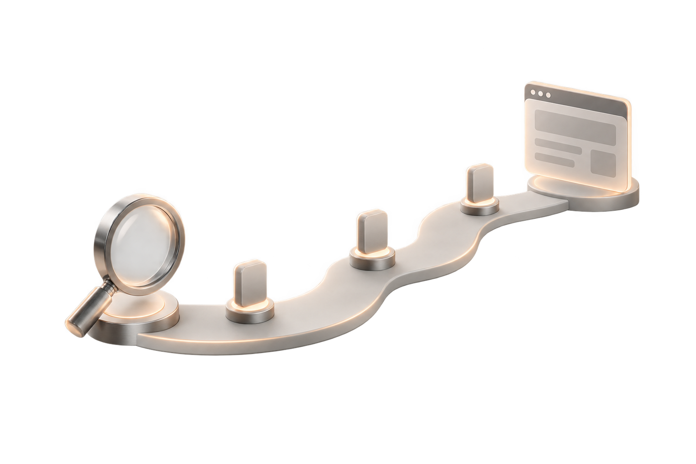
A landing page keeps the promise made in the search result and offers a next step that matches the need expressed. On a SaaS site, a search about a feature calls for an explanation of how it is used, its conditions and its limits.
Visitors should recognise the problem addressed, understand what the feature does and judge whether it fits their organisation. After that, a demo suits those who want to see it working; documentation better serves those looking for a precise technical condition.
The promise follows what the product really does, not wording picked to attract clicks. If the brand announces an autonomy the interface does not deliver, acquisition and product contradict each other. Brand and journey have to share the same decisions on the uses and limits of the service.
A shared method for optimising pages
Optimising for UX and SEO at once starts with what the visitor expects, which is then tested against the content, the interface and how it works technically. At mad.studio, journeys are designed with their production already in mind: every mock-up decision is examined together with its consequences for components, states and accessibility.
Start from the query and check the landing page
Analyse the query first: what does the visitor want to understand or do? Then compare the title, the snippet shown in the results and the answer present on the page.
User research confirms or corrects that reading: participants explain their need in their own words. If visitors expect the terms of a service and only find a brand presentation, the editorial answer is what needs fixing. Changing the colour of a button will not change that.
Review architecture, hierarchy and readability
The hierarchy makes decisive information easy to find without forcing a detour. A heuristic evaluation reviews navigation conventions and foreseeable difficulties; a user test confronts these assumptions with real tasks.
The UX design audit method takes this diagnosis further. For the relationships between pages, work on the site structure rather than moving blocks around one by one.
- Identify the expected answer on arrival.
- Use labels that are understood without explanation.
- Remove content that interrupts the task.
Check accessibility and performance
Accessibility checks verify access to information and features, while performance measurements cover loading and interactions. Fast loading does not make up for a control that cannot be reached with the keyboard.
Test the full journey, including error messages and states after an action. The checks cover observable situations:
- Reach the controls with the keyboard.
- Spot the focus and tell texts apart.
- Understand media without missing information.
- Check loading and how controls respond.
Define one measure per goal
Each change should answer a verifiable question: does the page stay visible, is the information found or does the interface respond smoothly? Write the question down before choosing the measure.
Conversion optimisation works on progress towards an action; it does not replace search tracking. Log content changes and interface changes separately, so a result is not credited to the wrong change.
Accessibility and content: a more inclusive experience
Semantic structure and accessible controls serve visitors who use a screen reader or navigate with the keyboard. Headings organise information; a button announces an action, a link a destination.
Check labels, navigation order and text alternatives for images that carry information. A decorative image and a diagram that explains a feature do not need the same treatment. Also check that instructions do not rely on colour alone.
In France, the technical method of RGAA 4.1.2, the French accessibility standard published by DINUM (the government’s digital directorate), has 106 test criteria to check the 50 WCAG 2.1 level A and AA success criteria adopted by the European standard. How search engines understand content and how accessible it is to people remain two separate goals: a supposed SEO gain is no substitute for checking the journey.
Measuring progress without mixing up goals
Track organic visibility, interface use and technical performance separately: progress on one says nothing about the other two. Ask whoever monitors your site for this split, be it a Webflow SEO agency or an in-house team.
Track visibility and crawling
Google Search Console shows impressions, clicks and the pages that appear in searches. Compare equivalent scopes and note what was published during the period studied.
Server log analysis goes through the requests the server receives and helps investigate crawling: bot visits, requested URLs. It tells you nothing, however, about how visitors understand the content.
A shift in visibility that follows a UX change does not prove that one caused the other. Also review changes to URLs, copy and links before attributing the result to the design.
Assess the experience with real tasks
A usability test covers a representative task, with the same goal and the same conditions for each version compared. The table below describes an evaluation method.
| Named measure | What you look for | Limit of interpretation |
|---|---|---|
| Task success rate | The person finds a condition or completes a request. | Success depends on the task and the participants. |
| Time on task | The person reaches the goal under the test conditions. | Speed does not prove understanding. |
| System Usability Scale (SUS) | A standardised questionnaire collects a rating of usability. | That rating does not predict SEO rankings. |
Also watch for hesitations and errors: they show where to step in, where an aggregated result can hide the difficulty encountered.
Compare field and lab data
A lab test reproduces a technical condition and compares changes. Field data, for its part, is collected from real users, with their devices, their networks and their contexts.
CrUX gives a field view of performance; RUM tracking covers the instrumented uses of the service. Check the scope available before comparing a page tested in isolation with a set of visits.
The diagnosis cross-checks these observations with the journey concerned. A display problem on an information page and a slow interaction during a request do not call for the same fix.
Redesigning without losing track of search
During a website redesign, track content and URLs before, during and after the switch: that is what best protects the rankings you have earned. Inventory the pages, identify those to keep and prepare the redirects before publishing.
While migrating, check titles and internal links, then freeze content at the moment of the switch. Once the site is live, check indexing, performance and journeys. A serious plan for a migration from WordPress to Webflow builds in these operations, without promising that rankings will hold.
For Dulcolax Italy, a Sanofi group brand, the site had a commercial role: in Italy, an over-the-counter (OTC) medicine can be sold online. Every piece of content went through approval by Sanofi’s Italian teams and by the Italian regulator, and the design system had to fit within the components and the CMS imposed by the group. The case proves no SEO result, but it is a reminder that approval circuits belong in the redesign plan.


