




A UX design audit finds what blocks a journey, from screens, data and real feedback. It gives you something you can act on to prioritise fixes before a redesign, a migration or a product change. If you have to decide fast, start with the friction points that affect several pages, then with the ones that keep coming back in the analytics or in user feedback.
What a UX audit is, and what it is not
A UX audit is a methodical evaluation of an existing interface, run from a grid of criteria, usage data and the observation of real journeys. It covers a website, a mobile app or a software product already in production, and it produces ranked findings rather than a list of opinions.
It is not a design review. We do not judge whether the interface is beautiful, we check whether the user understands where they are, what they can do and what happens after they act. Nor is it a user test: the audit rests on expertise and data, the test observes real people, and the two answer different questions.
The point is to help you decide. An audit tells you what to fix first, with what effort, and what can wait for a wider redesign. If it ends on a finding with no order of priority and no dependencies identified, it has described a problem without helping you deal with it.
What the diagnosis must reveal

A good diagnosis shows where the experience breaks, why, and what to decide next. On an interface, we look for problems of usability and ease of use, visual inconsistencies, friction points and blockages in the user journey.
The grid can cover four areas: screens and journeys, heuristics, behavioural data and accessibility. Each finding has to rest on evidence of its own, whether an analysis of the main pages, heatmaps, analytics, or a representative sample of pages for accessibility.
That keeps you from confusing an impression of the navigation with a structural defect. On the projects we have run to prepare a redesign, we look first at what comes up several times, then at what blocks a product decision or a technical switch.
| Area examined | Expected finding | Evidence | Decision triggered |
|---|---|---|---|
| Main pages, journeys | Recurring friction on a key step | Analysis of the main pages | Fix the journey before a redesign |
| Heuristics | Usability or ease-of-use gap | Nielsen's heuristics, Bastien and Scapin criteria | Prioritise interface fixes |
| Behavioural data | Blockage or drop-off area | Heatmaps, analytics | Check whether the problem is local or structural |
| Accessibility | Non-compliance on a sample of pages | RGAA 4, representative sample | Launch the priority accessibility fixes |
On a web audit, describing the defects is not enough. The findings have to be actionable, with a level of criticality and the expected impact on the rest of the project.
When should you trigger a UX audit?
A UX audit is useful when you see friction, inconsistencies or blockages coming back in feedback, journeys or data. An evaluation run on a website, a mobile app or a software product, with heatmaps and analytics alongside it, gives a good signal when the interface in production starts to drift from the expected use.
The timing is right if you are preparing a redesign, a migration or a new feature, and you need to know what to fix before you invest in the rest. A UX/UI audit on a website, a CRM or a mobile app helps you decide between a usability problem, a visual inconsistency and an obstacle in the journey.
The audit matters less if the main issue is the offer, acquisition or positioning. In those cases the interface is only a symptom. On the engagements we have led, an audit earns its place when a design or development project has to start with prioritised recommendations.
Audit method: framing, analysis, delivery
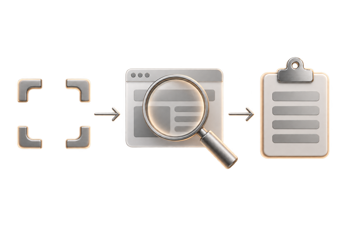
Set the questions the audit must answer
An audit starts with decisions to make, not with a list of screens. You set the depth, the access to data, the people to interview and what you deliberately leave out. When we prepare a Webflow website redesign or a migration from WordPress, this step keeps the work inside the budget and the timeline.
The deliverable has to answer concrete questions: where usage breaks down, which pages concentrate the errors, which technical dependencies could slow a fix. On projects that publish often, we also keep an eye on what has to stay stable during the switch.
Read the interface without stopping at a single screen
The analysis covers the main pages, the site structure that organises them and the journeys that connect them. An isolated screen can look coherent while the sequence breaks down at the moment of acting.
A UX agency looks at friction across several sequences, then notes the gaps between intention, interface and real behaviour. That comparison is what design and development decisions rest on.
Cross heuristics, data and real feedback
The ten usability heuristics published by the Nielsen Norman Group and the Bastien and Scapin criteria give a stable grid for spotting problems of usability and ease of use. Heatmaps and analytics show whether the finding comes back in real use. A second pair of eyes on the pages helps when the signals contradict each other.
This combination keeps the diagnosis from turning subjective. It also stops you over-reading an isolated anomaly when another indicator points to the same friction.
Deliver a usable action plan
The deliverable has to come out as prioritised recommendations, with a clear ranking of actions. A full PDF sent by email is still common, but the substance matters more than the wrapper.
- Describe the observed problem.
- Show the evidence used.
- Rank the criticality.
- Propose the action to take.
- Flag the technical or product dependencies.
Which audit for your context
"UX audit" covers very different scopes. The context decides how deep it is worth going, and so the budget.
| Context | What we look at first | Useful depth |
|---|---|---|
| Landing page or campaign page | A single journey, the promise and the form | Short expert review |
| Showcase site | Navigation, hierarchy of messages, points of contact | Expert review with analytics |
| E-commerce site | Category, product page, checkout, mobile | Audit with behavioural data |
| SaaS or product | Activation, recurring journeys, error states | Audit with user tests |
| Business tool or back office | Cognitive load, repeated tasks, shortcuts | Audit with observation of real users |
| Before a redesign or a migration | What must be preserved as much as what must be fixed | Wide audit, with a technical component |
What to provide before launching the audit
Delays come more often from access to data than from the analysis. Gathering these five items upfront noticeably shortens the timeline.
- Read access to analytics and Search Console.
- The two or three journeys that really matter to the business.
- Internal hypotheses: what the team already suspects.
- Known technical constraints, and what cannot move.
- Incidents and user feedback already reported, even informal.
How to prioritise friction points
Prioritisation rests on four criteria: severity, frequency, impact and effort. Most audit grids use three levels of criticality, low, moderate and high, which gives a first sort so that a cosmetic detail and a recurring blockage on a key step are not treated alike.
On a product or a Webflow redesign, we put first what affects several pages, what comes back often in feedback and what needs little coordination to fix. A problem that blocks a booking or sign-up journey weighs more than a visible but rare defect: that is conversion optimisation territory.
When a fix involves both design and development, especially on a custom site, weigh the cost of updating the system as much as the screen in question. That is what separates a quick win from a structural problem. The table below gives typical situations, as we find them on enrolment sites, brand activations, platforms built on a design system and booking journeys.
| Friction point | Criticality | Effort | Decision |
|---|---|---|---|
| Blockage on a step of a sign-up journey | High | Varies with the number of screens affected | Fix before the next release |
| Friction on a campaign activation page | Moderate to high | Low if the screen is isolated | Handle in the same batch as the UI touch-ups |
| Inconsistent components across the screens of the same platform | Moderate | Higher if the design system is affected | Decide with the product team and the tech team |
| Friction point in an online booking flow | High | Low to medium depending on the booking flow | Fix the step that cuts off the action |
In practice, the table separates what goes into an immediate fix from what joins a wider redesign. It is the starting point of a backlog that mixes design, content and development without putting everything on the same level. On Acadomia, we reworked the enrolment journey itself, design and experience included.
Expert audit, user tests and analytics: who does what?
The three methods answer different questions. The expert audit spots problems of usability and ease of use against a stable grid, user tests show how real people react to the interface, analytics and heatmaps show where usage concentrates or drops off.
Combine the three and you stop treating an intuition as evidence. An expert audit can see a defect on a page, but the data and the tests are what tell you whether it really blocks a journey.
| Method | What it brings | What it does not prove | Recommended use |
|---|---|---|---|
| Expert audit | Heuristic analysis, spotting friction | How much the problem really costs in use | First pass on a website or a software product |
| User tests | Reaction and understanding in context | Coverage of the whole site | Validate a critical journey or screen |
| Analytics, heatmaps | A reading of observed behaviour | The cause of the blockage | Spot the areas to dig into |
For a web UX audit, the right combination depends on the time available and the level of risk. On a site in production, the data usually gives the first signal, then expertise and tests turn that signal into a decision.
The deliverables to expect from a real diagnosis
A real diagnosis produces findings, prioritised recommendations and the dependencies to watch. A full usability report sent as a PDF works as a format, provided it brings out the quick wins, the medium-term topics and the points that affect several teams.
The deliverable also has to separate quick fixes from the work that needs design system, development or content decisions. That is where an audit becomes usable for a product backlog or for a Webflow redesign.
A criticality rating is also expected, low, moderate or high, so you know what to handle first. A read-out that does not separate the urgent from the secondary leaves the team to redo the sorting.
How much effort to plan by scope?
Effort follows the depth of the analysis first. An audit of a few main pages does not take the same time as a review of journeys, accessibility and technical coordination across a whole product.
The number of screens, access to data, workshops with the teams, user tests and accessibility all push the workload up. An audit on a representative sample of pages, as the French digital accessibility framework allows, can be faster than an exhaustive inventory, but it still takes method.
Technical points count too. When logging, analytics exports or account access are not ready, the diagnosis takes longer before the analysis even starts. On a project with a migration or a redesign, the back and forth with the tech team weighs as much as the screen analysis.
| Factor | What it changes | Example of impact |
|---|---|---|
| Depth | Study of pages or of complete journeys | More analysis and delivery time |
| Number of screens | Volume of points to examine | More findings to prioritise |
| Access to data | Quality of the available evidence | Less time lost rebuilding the context |
| Tests and workshops | Validation of hypotheses | An added preparation and synthesis phase |
| Technical coordination | Design and development back and forth | Slower decisions on structural fixes |
The grid to apply to an interface
The grid combines four families of criteria: the clarity of journeys, the consistency of interfaces, the understanding of content and the ability to act without hitting a wall. The Bastien and Scapin criteria and Nielsen's heuristics are the backbone of the examination.
Look first at whether the user understands where they are, what they can do and what happens after they act. Then check whether repeated elements keep the same logic from one page to the next. On a UX/UI audit, those points already surface part of the friction.
Add the behavioural signals when you have them: heatmaps, analytics, usage feedback. That keeps you from over-weighting a visual defect when the blockage comes from the journey or from content that is too dense.
If the interface also has to meet accessibility requirements, work against the RGAA: the method published by DINUM, the French government's digital directorate, describes exactly how the sample is built and how compliance is calculated. A representative sample of pages gives you a basis for checking without claiming to cover the whole site line by line.
What an audit costs, and what it saves you
The budget of a UX audit follows the depth requested far more than the number of pages. An expert review of a few main journeys, from data you already have, stays short. A review that adds user tests, an accessibility component and workshops with the teams changes scale, because each part adds its own preparation and write-up.
| Level | What it covers | What pushes the load up | When it is enough |
|---|---|---|---|
| Expert review | Heuristics, main journeys, existing data | Number of journeys, quality of analytics access | You know something blocks, not yet where |
| Audit with data | The review, plus heatmaps, analytics and Search Console | State of the measurement in place, data reprocessing | You have to decide between several hypotheses |
| Audit with tests | The two previous ones, plus user tests | Recruitment, running the sessions, analysing them | The decision commits you to a redesign or a product change |
| Accessibility component | Check on a representative sample of pages | Size and diversity of the sample, not the whole site | Regulatory obligation or planned upgrade |
The return on the spend is not in the report, it is in what the report avoids. An audit is useful when it stops you fixing several screens blind, when it ranks a recurring friction point ahead of a cosmetic detail, or when it shows that a blockage comes from the journey and not from the interface. If the site has one page and no friction signal, the effort is out of proportion.
One point to settle before signing: what gets delivered. Findings, recommendations ranked by criticality, the evidence used and the technical or product dependencies. Without those four, the team has to redo the sorting itself, and the audit will have cost money without taking work off anyone.
Choosing between an internal audit and a provider
An internal audit works when the team already knows the UI and UX criteria, has access to the data and can keep some distance from the interface. A provider is the better option when the product team lacks time, when an outside view is needed or when design, development and product decisions have to be joined up.
On a site being redesigned or migrated, an outside provider helps structure the read-out and turn friction points into backlog language. The case is weaker if the product changes very fast with no documentation and no access to analytics, because the diagnosis then rests on too many assumptions.
On the projects we have run for environments such as Visa, Blockz, a platform commissioned by the Core blockchain and delivered with its smart contracts on an audited stack, or Dulcolax, the value comes from joining up diagnosis, design system and delivery constraints. When the team can act on the findings straight away, the work moves faster.