




Prioritize pages that have already been visited and have strong intent first:fix one friction point, add proof in the right place, then test a single hypothesis over 30 days while also tracking lead quality.
What We Really Optimize When We Talk About Conversion
Conversion is the transition from a visitor to a useful action: request for a quote, booking an appointment, signing up, or downloading. When we talk about optimizing conversion,we mainly work on three things: message clarity, friction reduction, and the quality of reassurance.
To prioritize, we use a simple three-criterion matrix: impact on action, execution effort, and level of uncertainty. A useful lever combines high impact, low effort, and a hypothesis that is easy to verify.
| Criterion | Question to ask | Reading profession |
|---|---|---|
| Impact | Can the lever change the decision quickly? | We deal with what is closest to the point of action. |
| Effort | How much time and coordination does it take? | We start with what can be fixed without a major overhaul. |
| Uncertainty | Can the result be measured clearly? | We prioritize readable tests and clear hypotheses. |
This framework avoids conflating content optimization, design, and acquisition. A page canreceive a lot of traffic and remain underperformingif the visitor does not understand either the offer or what comes next.
- Low conversion often comes from a message that’s too broad
- Hesitation often comes from a lack of evidence in the right place
- A drop-off often comes from a path that’s too costly
- Poor lead quality often comes from a CTA that’s too vague
Which pages should be optimized first
We first optimize the pages thatare already receiving qualified trafficand which carry strong intent. Pages ofservice, landing pages and certain homepages are often the best starting points.
The right order depends on three variables: visit volume, proximity to conversion, and ease of updating. A page with little traffic rarely deserves priority, even if it seems imperfect.
| Page type | Priority | Reason |
|---|---|---|
| Service page | Very high | It captures an already-formed commercial intent. |
| Campaign landing page | High | It concentrates a unique message and objective. |
| Home | Variable | It performs well when traffic is high and mixed. |

We often observe that the best first move is not a complete overhaul. A useful priority is tocorrect an already published page, then measure the evolution of behavior.
- High traffic and strong intent come before graphic perfection
- Service pages and campaign pages often offer the quickest wins
- A simple page that’s easy to edit is more profitable than a complex page that needs to be redesigned
Fix the friction points that block action
Friction blocks action when the effort required seems greater than the expected benefit. We fix them by prioritizing what creates doubt, effort, or wasted time.
Abandonments often occur before the form, during reading, or at the moment when the visitor can no longer clearly see what comes next.
Message too vague or too broad
A vague message prevents visitors from seeing themselves in the offer. We clarify the audience, the result, and the promise in a brief read.
- Precisely identify the need being addressed.
- Show the expected result.
- Avoid overly generic phrasing.
Too long or too costly a journey
A cumbersome journey causes engagement to drop before the final action. Common signs include too many steps, redundant content, and overly long forms.
- Reduce the number of clicks.
- Remove duplicate content.
- Bring the key information forward earlier.
Forms, CTAs, and microcopy
The moment of action must feel simple. A clear CTA, a short form, and areassuring microcopyreduce perceived effort.
When we work on this point atmad.studio, we are looking for the shortest phrase that explains what comes next. This microcopy creates continuity between intent and taking action.
- Limit the fields to only the information that is truly useful.
- Name the action with a concrete verb.
- Add a short help note near the button or form.
Speed, mobile and readability
A slow pageor hard to read destroys momentum. On Webflow, conversion often depends as much on visual hierarchy as on technical performance.
We monitor media size, block density, and the reading order on mobile. An interface that is too crowded increases cognitive fatigue and reduces action.
Strengthen reassurance in the right place

Reassurance answers a simple question:why trust you now?We place it where doubt arises, not everywhere on the page.
Three functions need to be distinguished: proving credibility, reducing perceived risk, and choosing the right signals according to the type of page.
Proving credibility without overwhelming it
Useful proof is proof that clarifies the decision without distracting from it. A testimonial, a client case study, a result figure, or a certification can be enough if placed in the right spot.
- Put the proof close to the argument it supports
- Avoid stacking too many badges
- Prioritize elements that are consistent with the offer
Reducing perceived risk
The visitor is trying to understand what they’re committing to, how long it will take, and what happens after they click. Reducing perceived risk means making these elements visible.
According toService-Public.fr, a quote, a meeting request or a file submission do not involve the same expectations. The level of detail expected therefore varies according to the proposed action.
Choosing the right trust signals
Useful signals are not the same in B2B, in SaaS, and in services. In B2B, method and references often reassure more than volume. In SaaS, the product and the trial play a major role. In services, the clarity of the process and the quality of thecontactmatter a great deal.
| Page type | Most useful proof | Expected effect |
|---|---|---|
| B2B service | Case study, methodology, expertise | Reducing uncertainty about delivery capacity |
| SaaS | Demo, trial, product capture | Show practical usage and concrete value |
| Local service or expert | Reviews, process, timelines | Reassure about reliability and simplicity |
Build a B2B service page that converts
A B2B service page converts when it quickly answers three questions:what do you do, for whom, and why choose youIt must also show the way to move on to the next step.
At mad.studio, we often structure this type of page as a logical sequence: promise, method, proof, then action. This logic helps the reader decide without overload.
Hero Section: Promise and Segmentation
The hero should speak to a specific persona and an identifiable need. A promise that is too broad forces the reader to guess whether it applies to them.
We are looking for a phrase that links the problem to the outcome, with a clear business angle.
Body of page: evidence, method, and expected results
The page body should show how you work and what theclientcan wait. The method reduces uncertainty, while the expected results frame the promises.
A good sequence presents the pain point, the proposed solution, the proof, then the terms of collaboration. That is exactly the kind of structure we put in place when mad.studio designs a Webflow service page.
CTA: prompting action without breaking trust
The CTA works best when it asks for a simple, concrete action that matches the visitor’s level of readiness. A too-committal contact request can slow down an intention that is still exploratory.
A good call to action extends the reading. It doesn’t break it.
- Start with a light ask when the intent is low.
- Reserve appointment booking for pages that are already warm.
- Keep the button text aligned with the expected benefit.
Optimizing a Webflow landing page without weighing it down
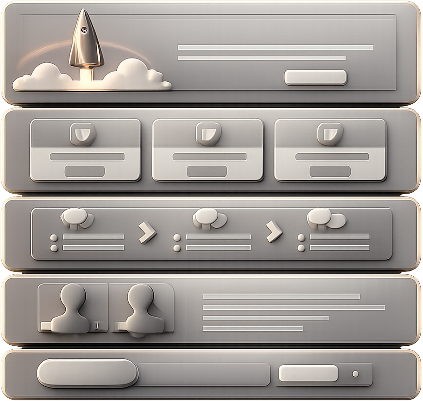
AWebflow landing pages convert better when the structure stays lean, fast and readable. The design should guide toward action, not add noise.
On this type of page, we combine design, content, and technical execution. The consistency between these three layers often makes the difference in conversion.
Visual structure and hierarchy
Visual hierarchy directs the eye toward what matters. A clear headline, a useful subheading, and a well-placed button are often enough to create the right rhythm.
- One main objective per screen.
- Readable visual contrasts on mobile.
- Short, well-separated blocks.
Performance and weight of components
A page that is too heavy slows access to the message. Images, animations, and certain components can weigh down the whole if we don’t make the right trade-offs.
On Webflow, performance directly supports conversion when it reduces waiting time and the feeling of friction.
Forms and integrations
The form should collect only the essential information and pass it along seamlessly. A poorly designed integration can sometimes create more friction than bad wording.
We also check the quality of lead routing, because a lead lost after submission does not count as a useful conversion.
Consistency between design, content, and tracking
Tracking must follow the logic of the page. Otherwise, we’re measuring clicks without knowing whether the decision is actually progressing.
At mad.studio, this consistency is central when we build a Webflow site designed to generate leads. Design, content, and measurement must tell the same story.
Testing hypotheses without degrading lead quality
A test has no valuewhether it improves conversion without lowering qualitySo we test specific hypotheses, with a before/after read on volume and on qualification.
The best practice is to isolate one lever at a time. If we change everything, we no longer know what actually produced the effect.
- Formulate a single hypothesis related to an identified friction.
- Define a primary indicator and two guardrail indicators.
- Launch the test over a sufficiently stable period.
- Compare the results with the behavior of the leads obtained.
Guardrail metrics avoid false gains. A conversion rate that rises but produces fewer qualified leads is not a victory.
Measuring Lead Quality Before Validating a Test
To know whether we have really succeeded inoptimize conversion, we don’t settle for a simple traffic spike or an increase in clicks. At mad.studio, we prioritize indicators that measure the real business impact of a Webflow site, a landing page, or a lead generation journey. Here are the three validation KPIs we look at first.
- Global conversion rate: it measures the share of visitors who complete the expected action (contact request, demo request, sign-up, purchase). If it increases steadily, it’s the most direct signal that a conversion optimization is working
- Conversion rate by traffic source: it makes it possible to compare performance across SEO, paid advertising, social media, or email marketing: one source may bring less volume but generate much more qualified leads, which completely changes how the site is evaluated
- Conversion rate by funnel stage: it shows where users drop off between the landing page, the form, validation, or payment. If a step creates a major blockage, we know exactly where to fix the interface, the messaging, or the UX friction

In practice, effective management does not consist in tracking a single number, but in cross-referencing these three KPIs with the business context. For example, on a B2B site designed by mad.studio, an increase in the overall conversion rate can be misleading if lead quality is declining at the same time. Conversely, a slight drop in volume may be acceptable if the qualification rate improves significantly.
30-Day Action Plan
| KPI | Reading threshold | Source |
|---|---|---|
| Conversion rate | To be read in the context of the page and the channel; significant variation if the gap is clear before/after | Analytics / page tracking |
| Qualified lead rate | Compared to the total volume of leads over the same period | CRM / Sales follow-up |
| Actionable requests share | To follow as a stable signal over time, not on an isolated spike | CRM / internal qualification |
| Time to Conversion | To be read in line with the initial intent and the type of page | Analytics / CRM |
Over 30 days, we start by diagnosing, then we fix the priority friction points before testing. This pace makes it possible to move forward without disrupting production.
The most effective sequence remains simple: observe, classify, correct, measure.
- Week 1 :Identify high-traffic pages and visible friction points
- Week 2:correct the message, the CTA, and the weakest proofs
- Week 3 :launch a test on a priority lever
- Week 4:analyze lead conversion and quality
This plan works well for a B2B website as well as for a Webflow landing page. It creates a short, readable flow focused on decision-making.
Common pitfalls to avoid
The most frequent mistakes do not come from a lack of ideas, but from scattering efforts. We mainly avoid actions that complicate analysis or degrade readability.
- Testing without sufficient volume
- Changing too many variables at once
- Optimizing a page without commercial intent
- Add proof without clarifying the offer.
Useful optimization stays focused on a specific point. As soon as the page becomes too dense, conversion loses clarity.


