




A site structure organizes pages to improve SEO, navigation, and conversion. It defines content hierarchy and user journeys. Well designed, it reduces friction and boosts business performance.
What is a site structure?
A site structure is the structure that connects all the pages together. It defines which content exists, its priority level, and the way a visitor moves from one topic to another.
The menu is only its visible translation. The structure, meanwhile, organizes the site’s core, conversion journeys, and SEO logic. When it’s clear, it’s easier to understand where to go, what to read, and which action to take.
In our projects, we see it as the backbone of the site. It’s what prevents isolated pages, unnecessary duplicates, and overly deep journeys. At mad.studio, this step often structures the work before any Webflow mockup.

For a reader, the goal is simple: find an answer quickly. For the business, the goal is broader: guide navigation toward pages that generate a contact, a demo request, or useful information gathering.
A well thought-out site structure therefore serves three goals at once :
- clarify the available content
- reduce navigation friction
- highlight the pages that matter most for the business
Building the structure step by step
An effective structure is built before design, before final content, and before development. The most robust method follows five phases: frame, sort, prioritize, validate, then translate into the production tool.
This sequence avoids late-stage trade-offs. It also helps produce a readable sitemap, coherent wireframes, and a structure that’s easy to maintain over time. For a Webflow site, this rigor often saves time during the build phase.
Frame the site structure project
Framing consists of identifying the site’s main objective and target audiences. A lead-generation site, a brand site, and a product platform do not require the same page logic.
At this stage, we list existing content, business goals, and production constraints. The expected deliverable is often a framing document or a simple editorial inventory.
- primary conversion goal
- main and secondary targets
- available and missing content
- technical or editorial constraints
Content sorting
Sorting makes it possible to separate what should stay, what should be merged, and what can disappear. It’s a decisive step when the site contains a lot of pages historical pages or content produced by several teams.
Here we aim to avoid repetition and weak pages. This phase often produces a content map with a clear status for each page.
Prioritization
Prioritization ranks pages according to their role in the journey. A page can be strategic for SEO, useful for social proof, or essential for conversion without being at the same level as the homepage.
We then arbitrate between three dimensions: visibility, usefulness, and depth. This is the step that turns a content inventory into a true site structure.
Business validation
Validation consists of having the structure reviewed by the relevant teams. Marketing, product, management, and sometimes customer support do not always have the same view of priorities.
The right deliverable is a validated sitemap, with the main labels and relationships between pages. With mad.studio, we observe that this validation greatly reduces wireframe revisions later in the project.
Webflow translation
The final phase consists of turning the validated structure into a page, collection, and template architecture. In a Webflow studio, this step aligns content logic with build logic.
The expected result is a stable foundation for the design system, templates, and future page additions. This is the kind of transition that mad.studio often structures when the team needs to move fast without losing overall consistency.
How to prioritize pages without losing the reader
Prioritizing pages means deciding which information should be seen first. The right rule is to put the most useful pages for the user first, then the pages useful for conversion, and finally support content.
This logic avoids putting a product page, a blog post, and a contact page on the same level. It also helps teams prepare readable wireframes and coherent sitemaps in a Webflow studio.
| Criterion | Question to ask | Common decision |
|---|---|---|
| Conversion | Does the page trigger a contact, a demo, or a request? | High priority, visible early in the structure. |
| SEO | Does the page target a strategic query or strong intent? | High priority, with strengthened internal linking. |
| Proof | Does the page reassure users with expertise, case studies, or results? | Medium to high priority depending on the buying cycle. |
| Support | Does the page help users understand without converting directly? | Secondary priority, but useful for depth. |
To make quick decisions, we always compare pages using the same criteria. The decision then becomes more objective and easier to share across marketing, design, and development.
- define each page’s role
- sort by impact on goals
- check alignment with the user journey
- check the content’s place in the site depth
A good hierarchy does not mean everything should be visible everywhere. It means each page has its place, according to its real function in the experience and in the conversion funnel.
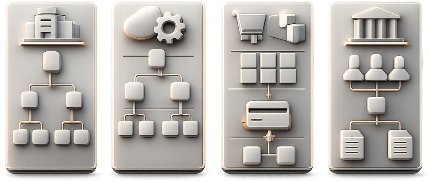
Which types of structure depending on the website?
The type of structure depends on the site model and content volume. A showcase site, a SaaS, an e-commerce site, and an institutional site do not have the same navigation logic or the same editorial priorities.
This distinction avoids copying a model that works elsewhere but not here. It also makes it possible to anticipate templates, SEO needs, and conversion areas from the design phase onward.
Structure by site type
A showcase site stays simple: home, services, about, work, and contact are often enough to lay the foundation. The goal is to reassure quickly and make the offer clearly visible.
This structure works well for SMEs and service brands. It keeps depth light and limits unnecessary pages.
- Home
- Services
- Projects or case studies
- About
- Contact
Structure for SaaS and digital products
A SaaS needs pages that connect proof, features, and use cases. The visitor must quickly understand the product, its value, and the problem it solves.
The structure then supports the move from discovery to demonstration. This model also helps prepare reusable feature pages.
- Product
- Features
- Use cases
- Pricing
- Resources
- Request a demo
E-commerce and catalog structure
An e-commerce site relies on categories, subcategories, and product pages. The challenge is to keep a clear structure while leaving room for SEO and filters.
In this context, the structure must support fast search and intent-based browsing. It also needs to remain scalable if the catalog grows.
- Main categories
- Subcategories
- Filters
- Brand pages
- Product pages
- SEO content to help users choose
Institutional or multi-site structure
An institutional site or a site network requires stronger governance. Editorial territories, audiences, and update responsibilities need to be distinguished.
Here the structure serves brand consistency and organizational clarity. It prevents each entity from building its own vocabulary without a shared framework.
- main site
- sections by audience
- subdomains or sub-sites if needed
- governance pages
- resource or news areas
Concrete site structure examples by project
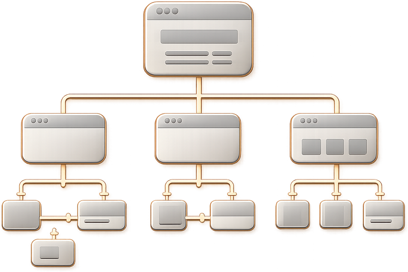
The best structure is not the longest one, but the one that fits the project. The expected conversion level, the number of contents, and the level of digital maturity completely change the structure to adopt.
In our projects, we often start with a simple schema, then add only the necessary levels. With mad.studio, this approach makes it possible to stay readable while keeping room to evolve the site.
Example of a structure for a showcase site
For an SME or a service brand, the structure can remain very compact. The key is to present the offer, build trust, and direct users to contact.
Home > Services > Service detail > Projects > About > Contact
This logic works well when the main goal is generating qualified inquiries. It limits unnecessary detours and makes reading immediate.
- a homepage focused on value proposition
- a few clearly distinct service pages
- visible proof
- a clear contact entry point
Example of a structure for a SaaS startup
For a SaaS startup, the structure must reassure and convert without overwhelming the visitor. Pages need to cover the problem, the solution, proof, and the call to action.
Home > Product > Features > Use cases > Pricing > Resources > Demo
This organization works well when the buying cycle requires comparing several solutions. It also helps separate acquisition content from conversion pages.
Example of a structure for an e-commerce site
An effective e-commerce site reduces the number of steps between intent and product. The structure should therefore start from the catalog, then move down toward the most useful categories.
Home > Universe > Category > Subcategory > Product page > Cart > Help
This logic facilitates the buying journey and transactional SEO management. It can be enriched with advice pages if the catalog needs guidance for decision-making.
Example of a structure for an organization or group
A multi-activity organization must balance global consistency and local autonomy. The structure needs to distinguish audiences, entities, and the content specific to them.
Group home > Entities > Territories > Resources > News > Careers > Contact
This architecture works when several teams publish different content. It also clarifies editorial governance and update responsibilities.
Structure, SEO, and redesign: key points to watch
During a redesign, the structure directly affects SEO, URLs, and internal linking. A new structure can improve readability, but it can also hurt performance if transitions are poorly prepared.
The issue is therefore less visual than operational. You need to secure the matches between old and new pages, then verify the continuity of popularity signals.
URLs, redirects, and SEO continuity
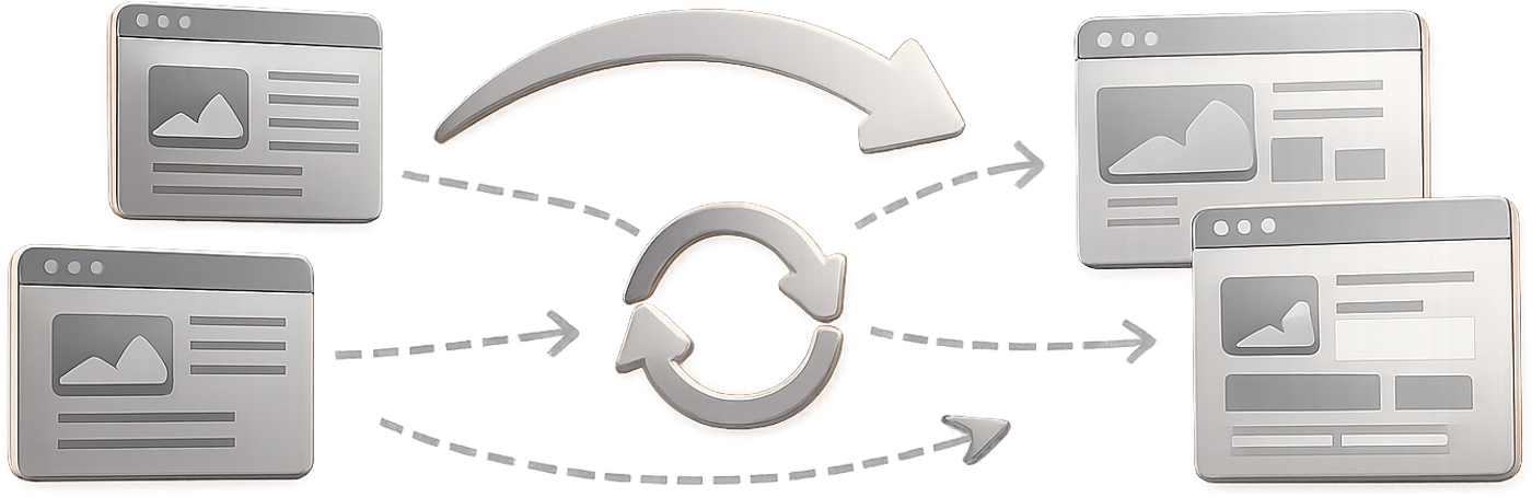
A redesign must maintain a clear path between the old pages and the new ones. If a page changes address, a redirect must preserve the continuity of the experience and technical signals as much as possible.
We then check each page-to-page match. This work relies on the initial inventory, existing URLs, and traffic priorities.
- map the old URLs
- match each page to its new target
- avoid redirect chains
- test strategic pages before launch
Internal linking and click depth
The structure directly influences internal linking. The more important a page is, the more it should receive useful links from nearby, relevant pages.
Click depth also affects discoverability. A structure that is too deep hides content that is nonetheless strategic for SEO or conversion.
Coordination between SEO, design, and development
A good redesign requires real coordination between teams. SEO provides the structural logic, design translates the journeys, and development secures implementation.
When the team works in silos, trade-offs get lost. When it moves forward together, the structure becomes a true production tool rather than just a validation document.
The most common mistakes to avoid
Structure mistakes often come from too much content or a lack of hierarchy. They create sites that are hard for visitors to understand and complex for teams to maintain.
The good news is that these mistakes are fairly easy to spot. You just need to test the structure from a business perspective, an SEO perspective, and a user perspective.
- put too many pages at the same level
- multiply very similar labels
- create sections without a clear role
- ignore redirect constraints during a redesign
- keep weak pages “just in case”
- forget links between complementary content
Another common mistake is confusing depth with richness. A rich site doesn’t need to be complicated; it needs to be organized.
In the projects we support, the most profitable fixes often concern duplicate pages, overly broad menus, and invisible conversion paths. That’s where clarity gains efficiency the fastest.


